to refresh your memory, here are photos of our old kitchen:
i loved that kitchen. we remodeled it ourselves. it was the first kitchen i chose for us. dad and i did all the demolition, and E and i picked out the new cabinets, appliances, counters, drawer pulls, and fun features (like a pull-out trash/recycling drawer and large drawers instead of cabinets under the counters). being a personal chef, i spend a lot of time in the kitchen. so a good kitchen is important to me.
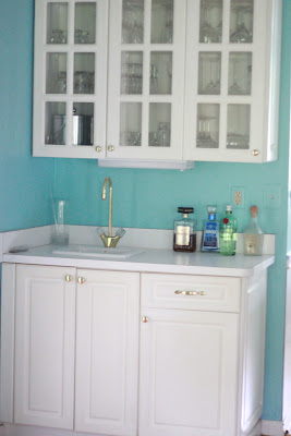
there are several things i love about our new kitchen - the size, lots of counter space, the layout, lots of cabinet space, the big window over the sink, and the wet bar area.
we even have some bonus cabinets to the right of the fridge.
we had the walls painted. the original color was a kind of bright periwinkle. it wasn't bad but it wasn't our cup if tea.
before (day before move in):
i saw this color and fell in love with it. it reminds E and i of the ocean - the turquoise blue waters of the caribbean. it's bright, it's cheery, and it's a "me" color. it makes me happy.
after:
the second thing i changed were the knobs and pulls. i love that the cabinets are white(ish) but wasn't in love with the brass/gold pulls. i switched them for a brushed silver pull that i think gives the kitchen a bit of a more modern sleek look. it wasn't a quick job (there were 54 knobs and pulls to replace!) but it's finally finished and i love it.
before:
after:
that's a little hard to see. here's a close-up before:
and after:
one thing at a time i tell myself . . . one thing at a time . . .


Love your kitchen, would love to see photos of the rest of the house. (not necessarily on your blog). Uncle Jimi
ReplyDeleteThe new paint color is awesome. It’s so great what a huge difference a paint job can make. I think the white counter-top looks a lot better than the previous one. It really brightened up the room! Great job with your kitchen, and congratulations on achieving this on your own!
ReplyDeleteI love the white and black contrast of your kitchen! It makes it so elegant. They also make the entire look of the kitchen clean. I hear color contrast is important if you want the color of your food to stand out. I’m sure fresh fruits and vegetables will look good on your island.
ReplyDelete